Project Summary
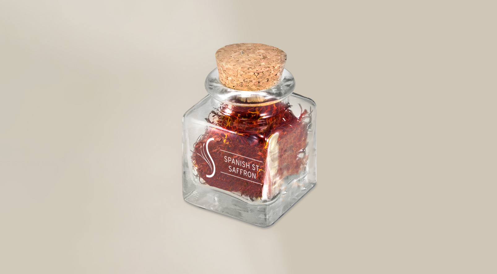
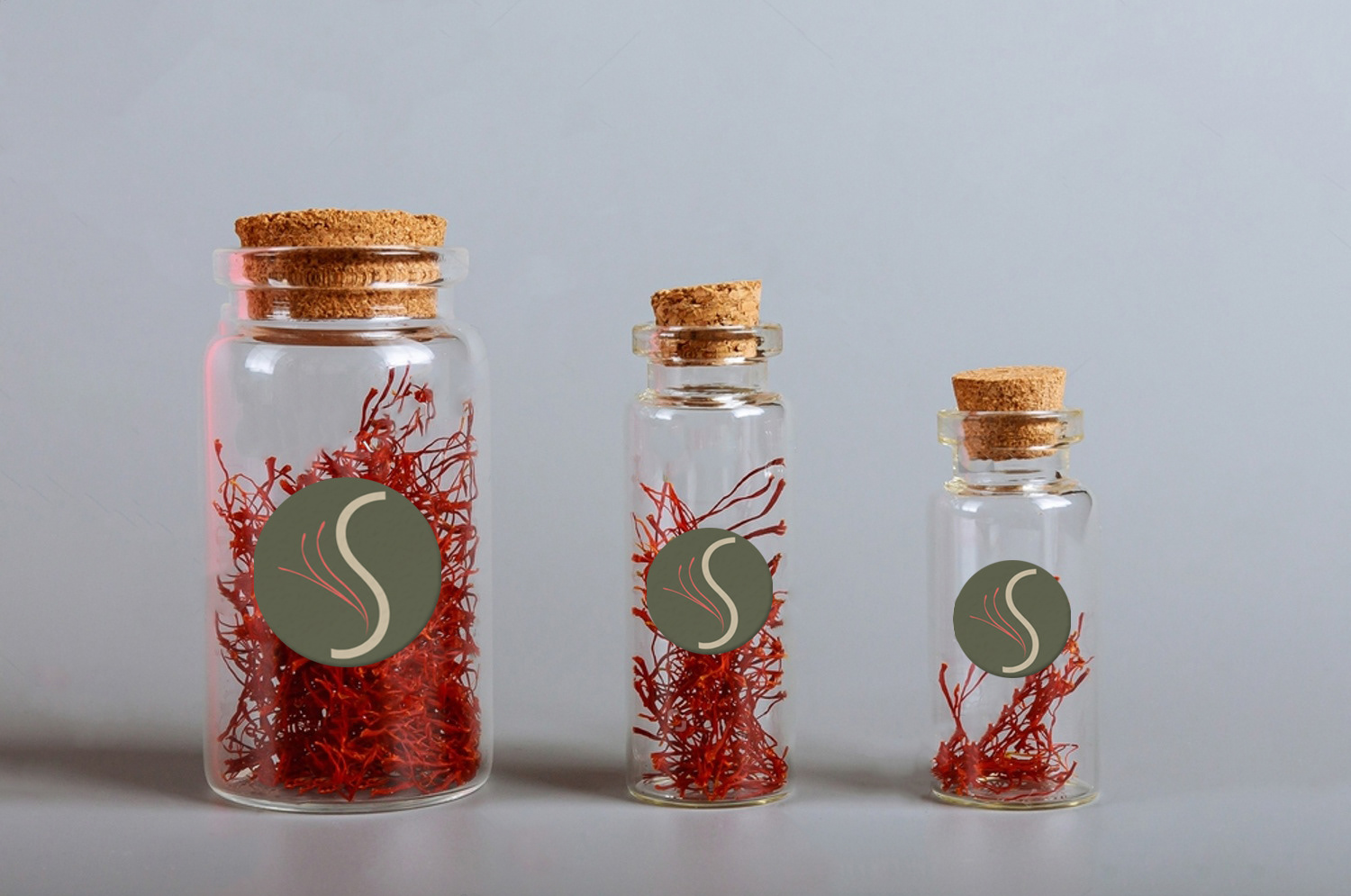
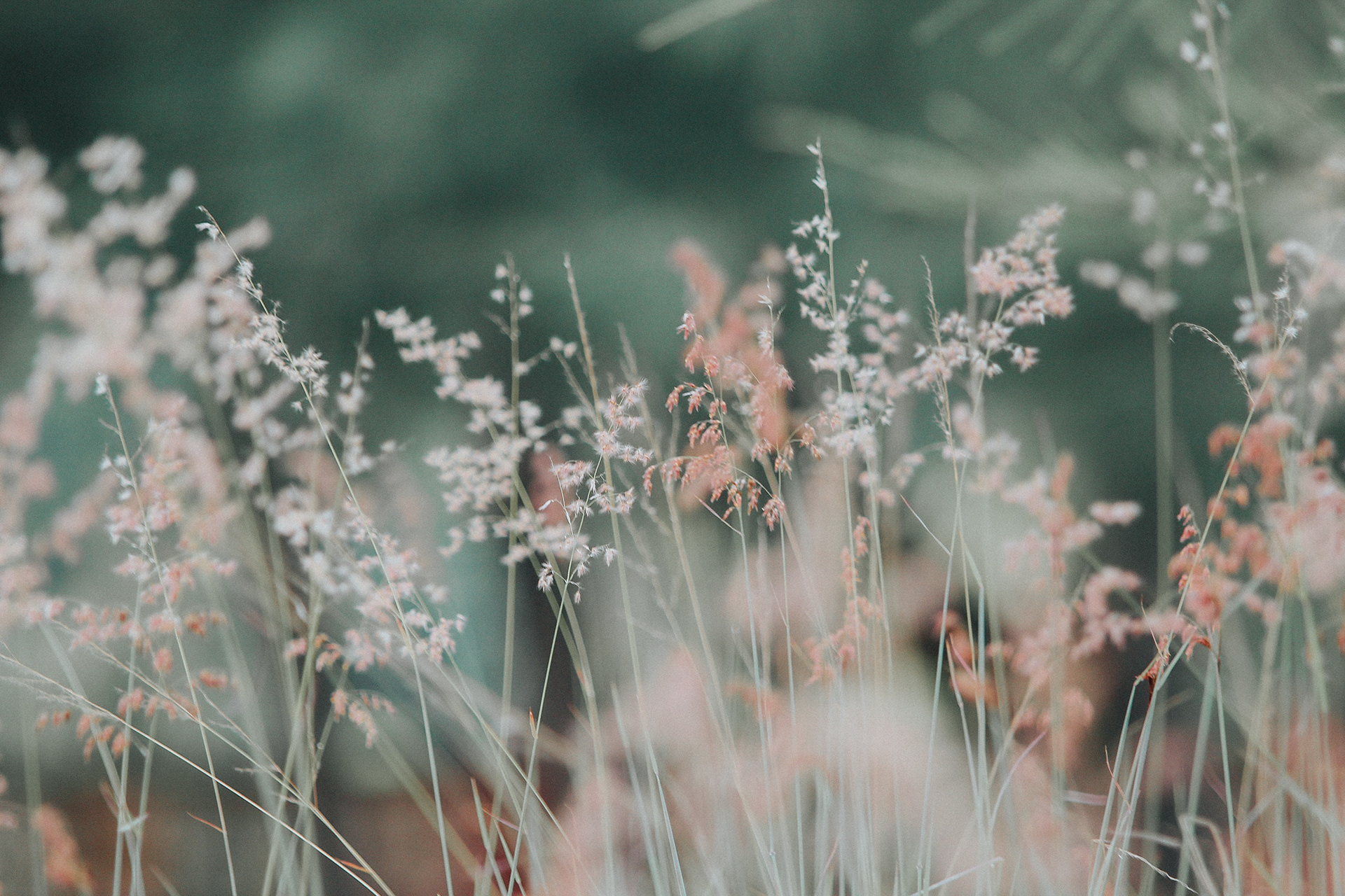
I did this branding project for my mom who grows and harvests saffron for paella and other dishes. This is a theoretical project in case she wants to take her homegrown saffron business to the next level. I designed the logo and color palette to reflect the earthy, homegrown nature of her business. I wanted the branding to be modern and clean while still conveying a warm and approachable vibe.
Role: Logo & brand designer
Tools: Adobe Illustrator, Adobe Photoshop
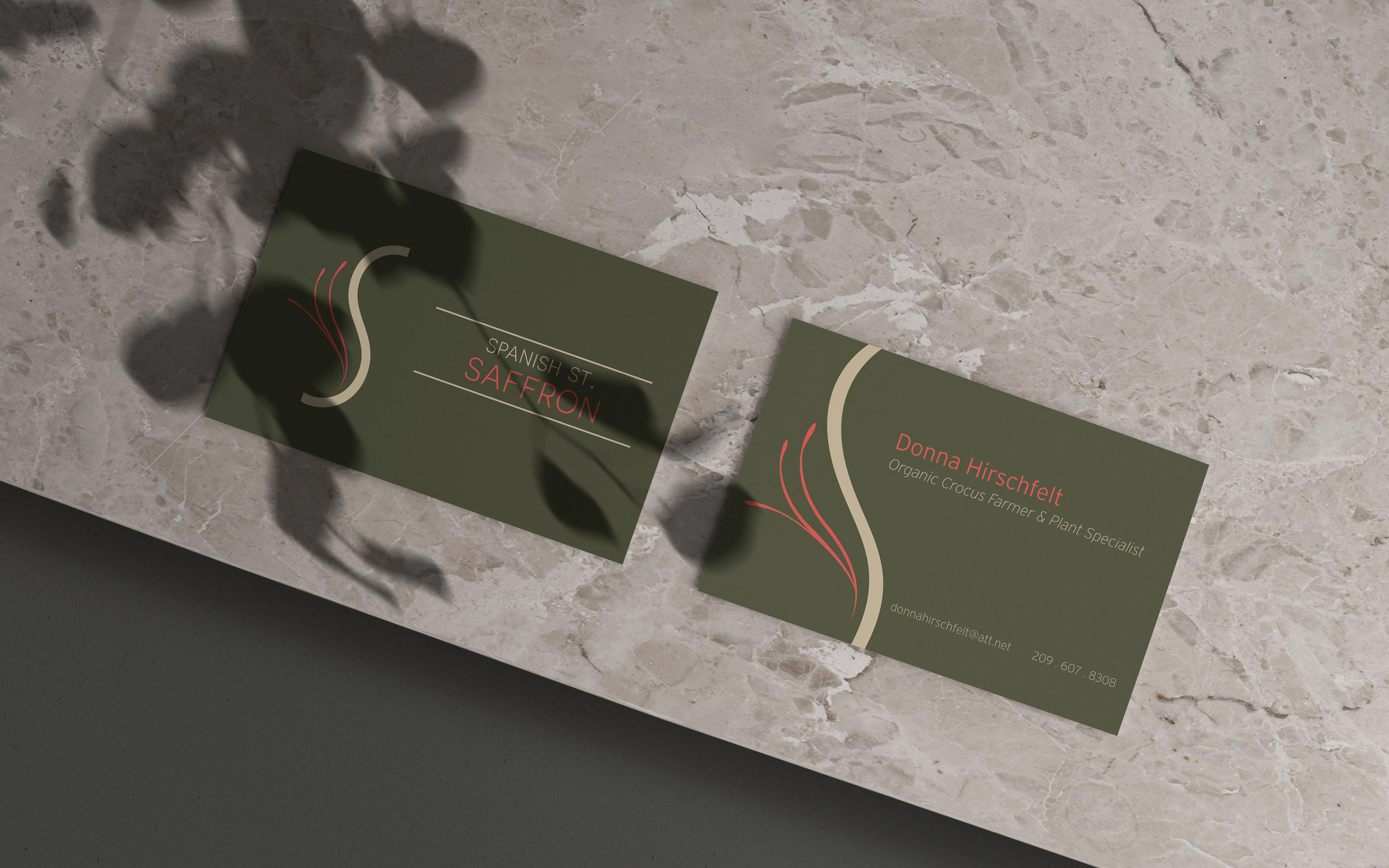
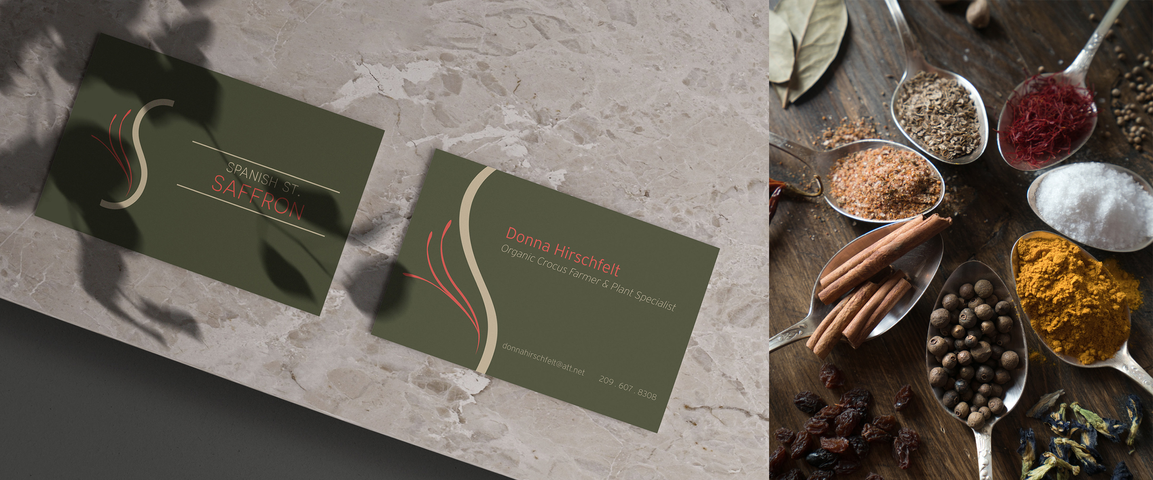
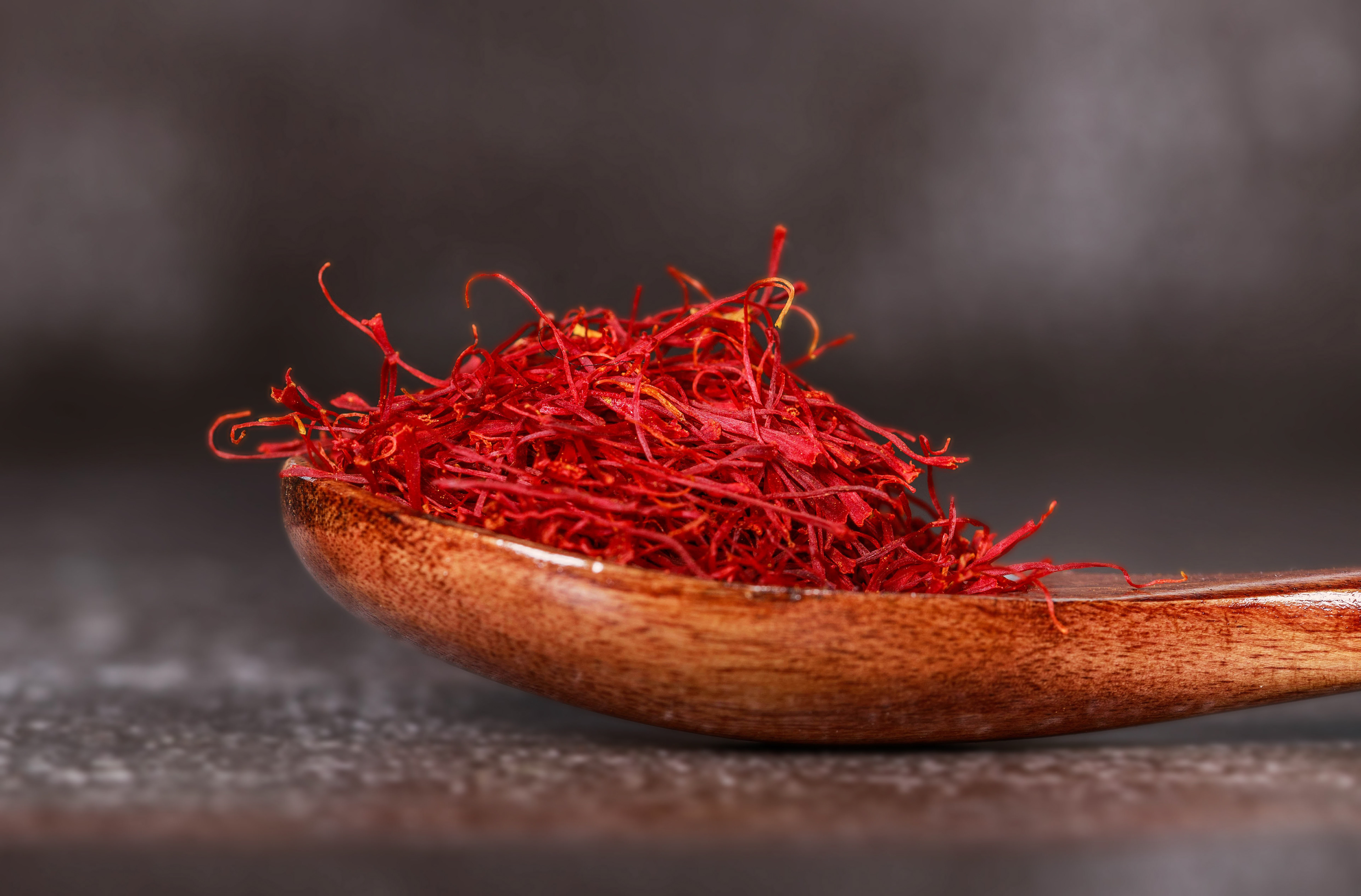
I wanted the business card to showcase the stigmas (red-orange female plant parts) of the crocus that are harvested and eaten as a seasoning. This is why the back side features a close-up of the logo design. The wavy s-shaped stigmas also inspired the loose curves of the "S" in the logo design and provided an element of interest in the overall composition.

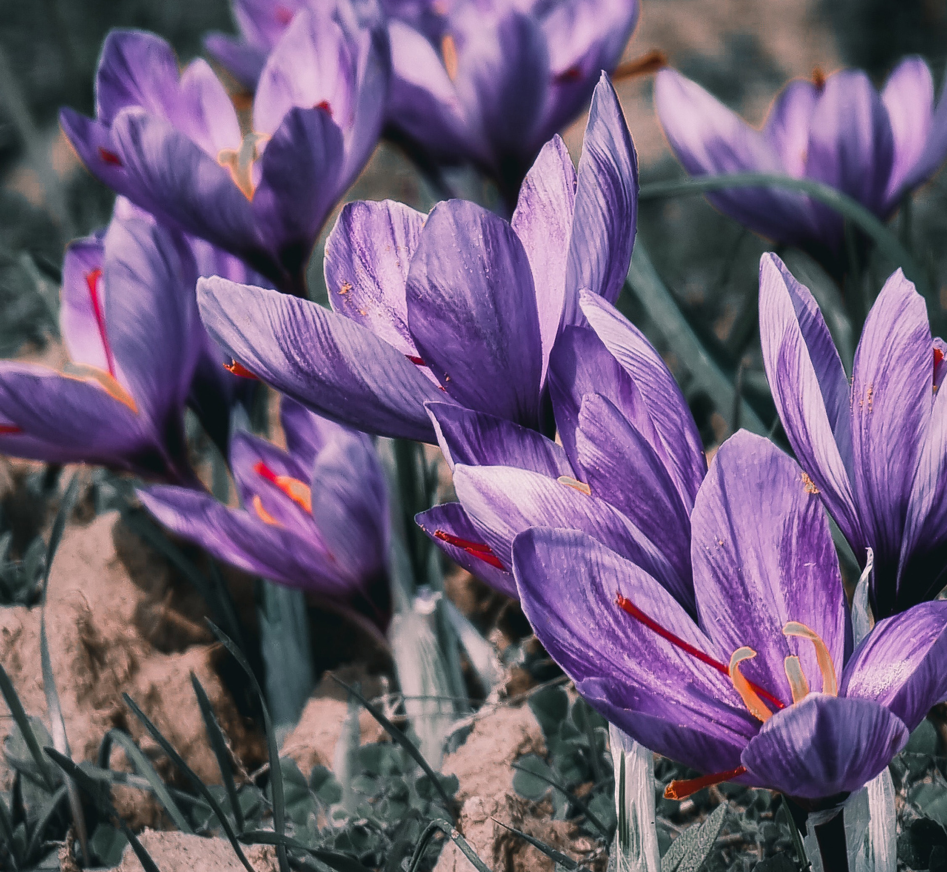
The red forms illustrated in the logo design are inspired by the crocus stigmas that are harvested once the crocus flower blooms.
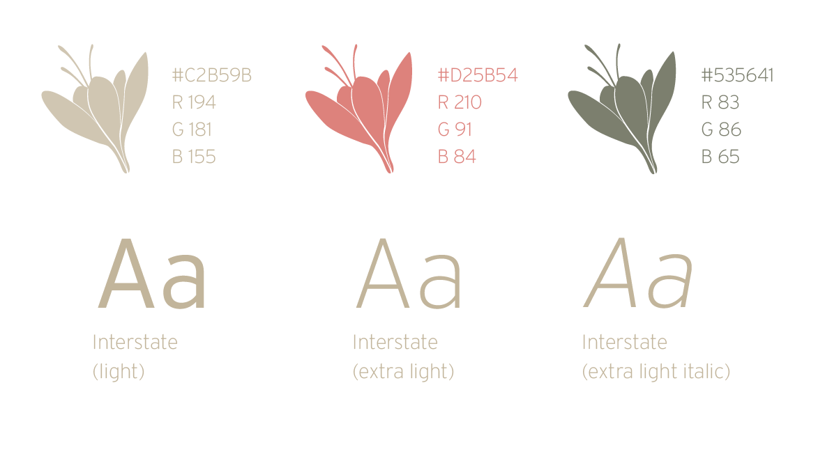
Graphic Standard
Logo Construction

I wanted the logo to evoke a sense of comfortable luxury, reflecting the homegrown roots of the saffron business to a more upscale clientele. I picture gourmet restaurants and local wineries investing in the product. The logo needs to be attractive enough for upscale/luxury businesses, yet be approachable enough for tourists and locals alike.
Clearspace Formatting
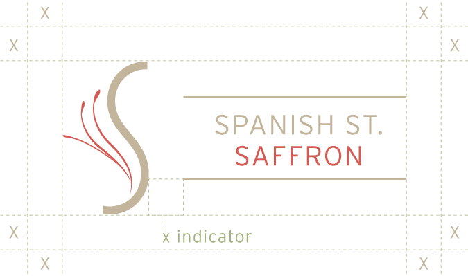
Horizontal Logo
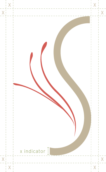
Vertical / shortened logo