Project overview
This is a case study built around the development of my personal logo. The design process from ideation to completion took me a total of two weeks and included equal parts self-reflection, creativity, (and a healthy does of second-guessing), before arriving at the final product.
Role: Logo Designer
Tools: Illustrator, Photoshop
Thumbnail Sketches
During this phase, I tried three approaches: 1.) earthy/environmental, 2.) design tools + letter 'K', and 3.) Animal symbolism based on my Chinese heritage. I knew that I wanted the logo to be image-based, and not a generic letterform of my initials. The biggest challenge was figuring out how to balance form vs. meaning. I wanted my logo to convey my values, character, and design principles, without coming across as messy or overdone. In the end, I chose to prioritize visual appeal over symbolism since that would be better understood by my audience. I chose to move forward with three of the most legible sketches that I felt conveyed who I am at a glance.
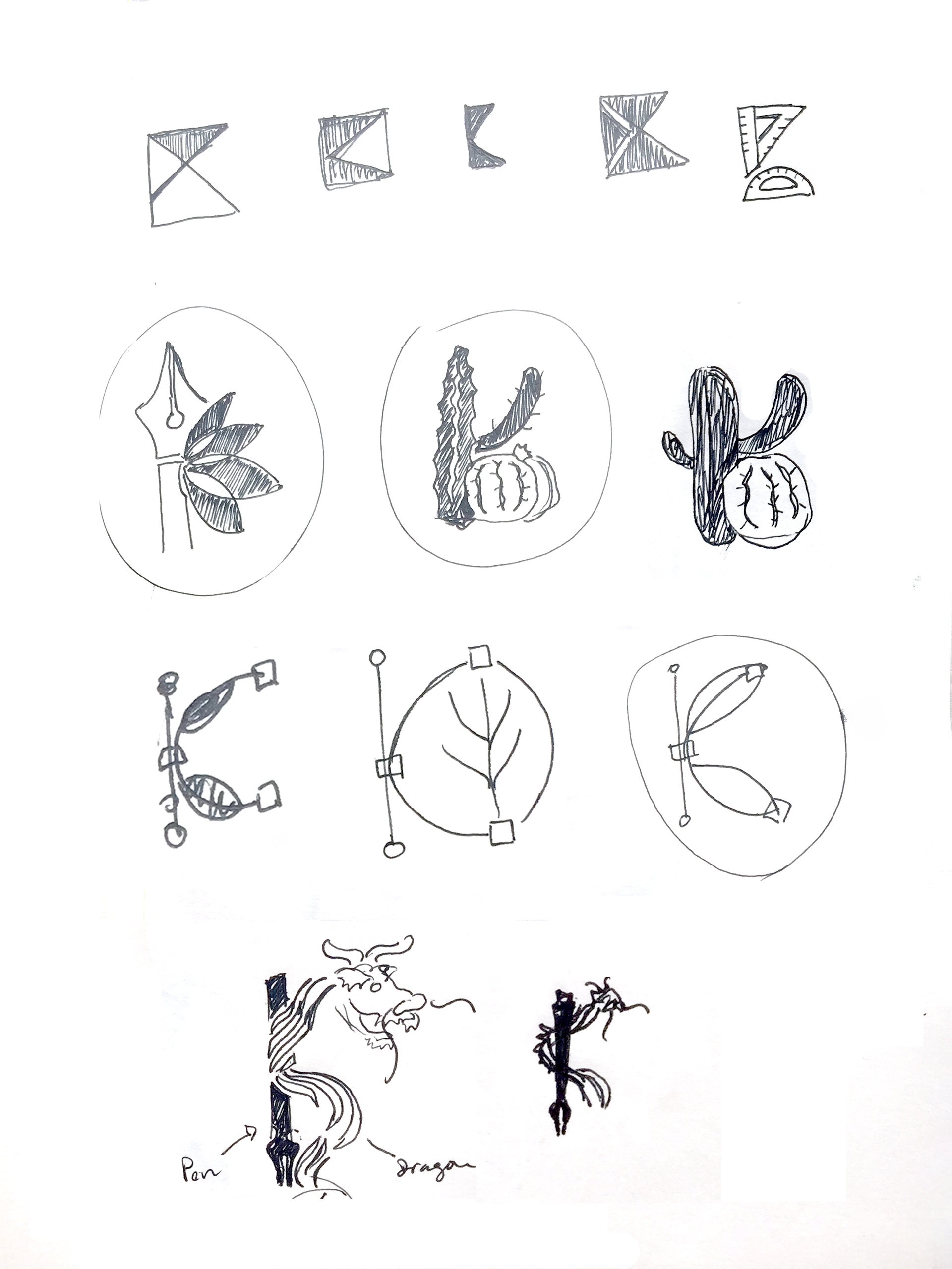
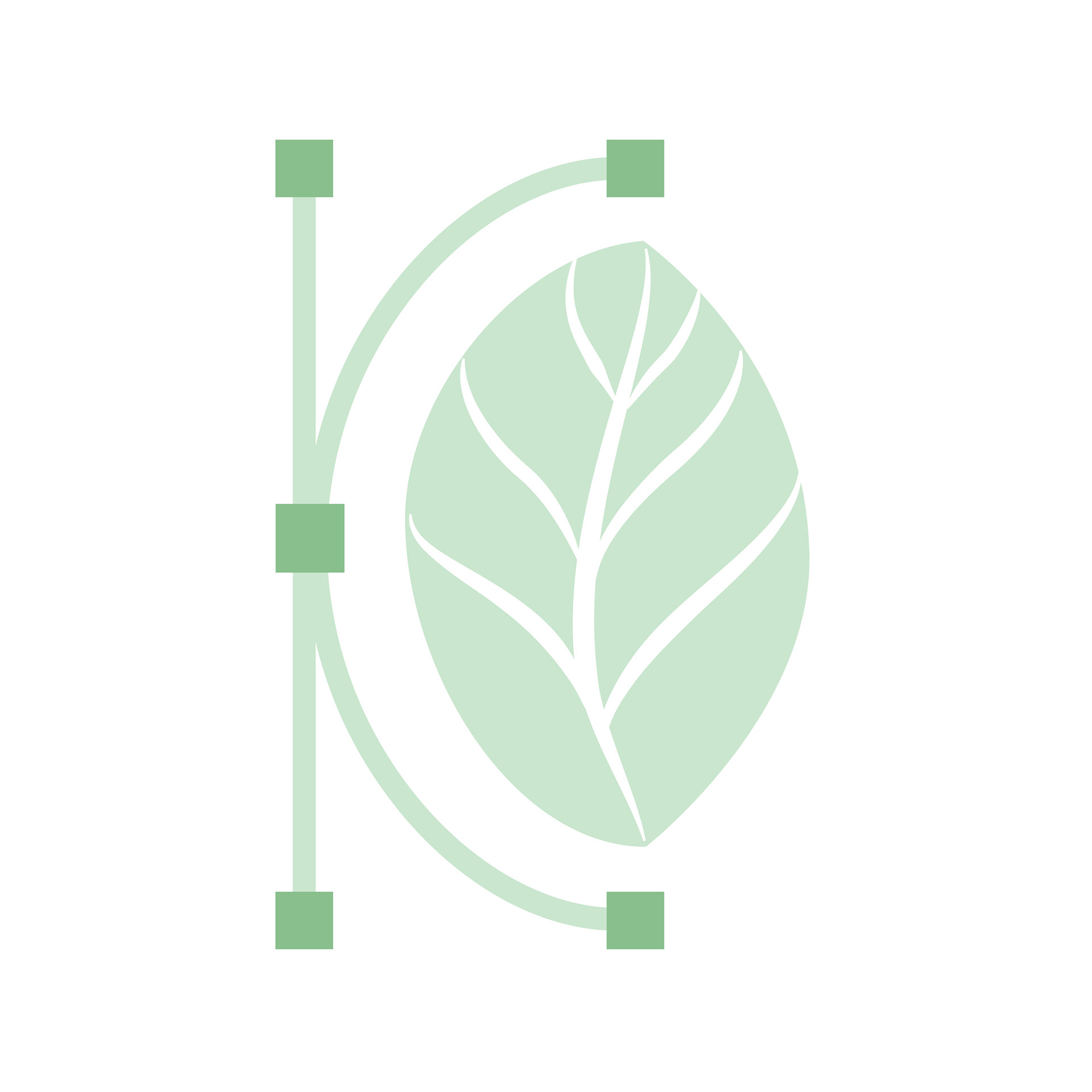
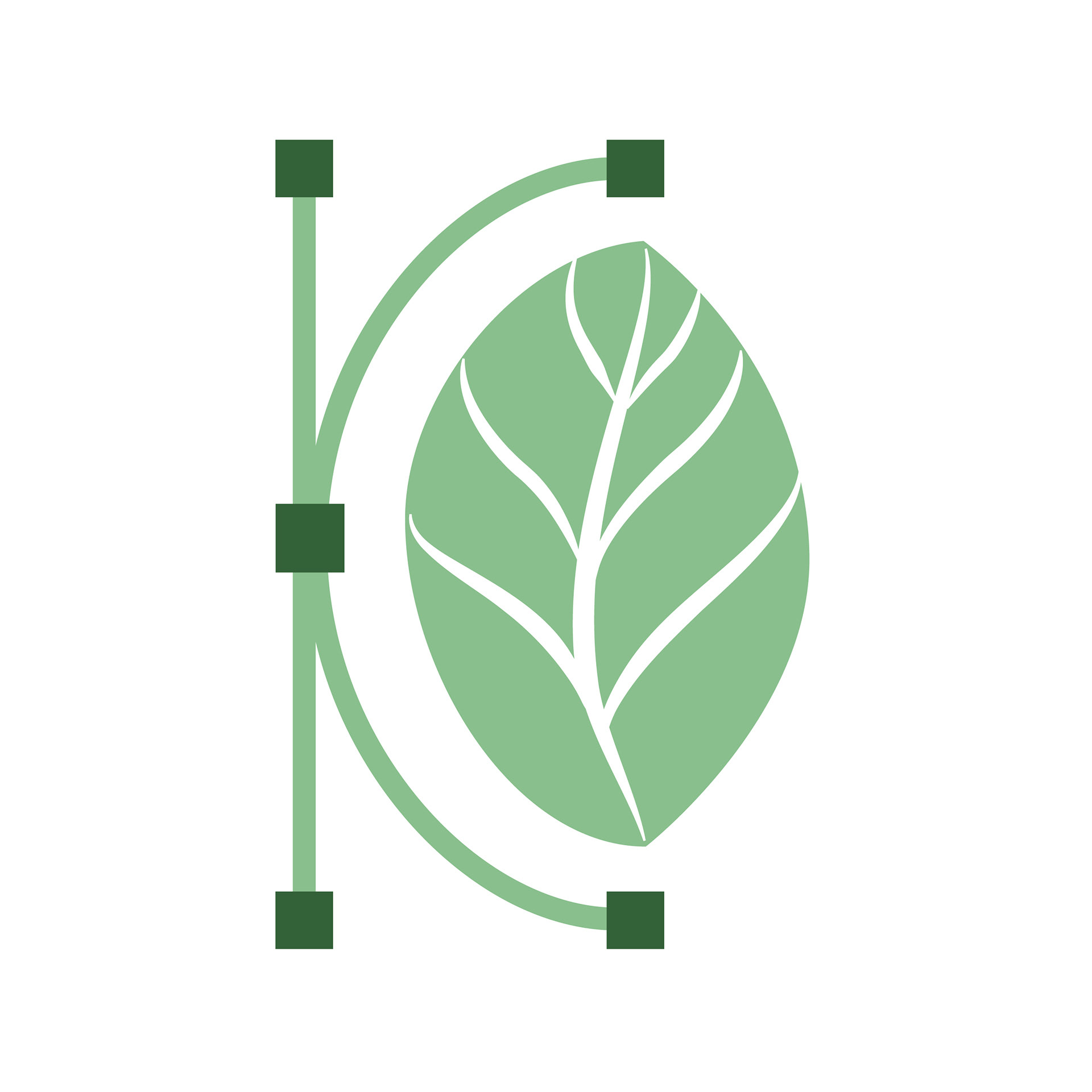
Exploration of the intersection between sustainability and design through plant motifs combined with design tools.
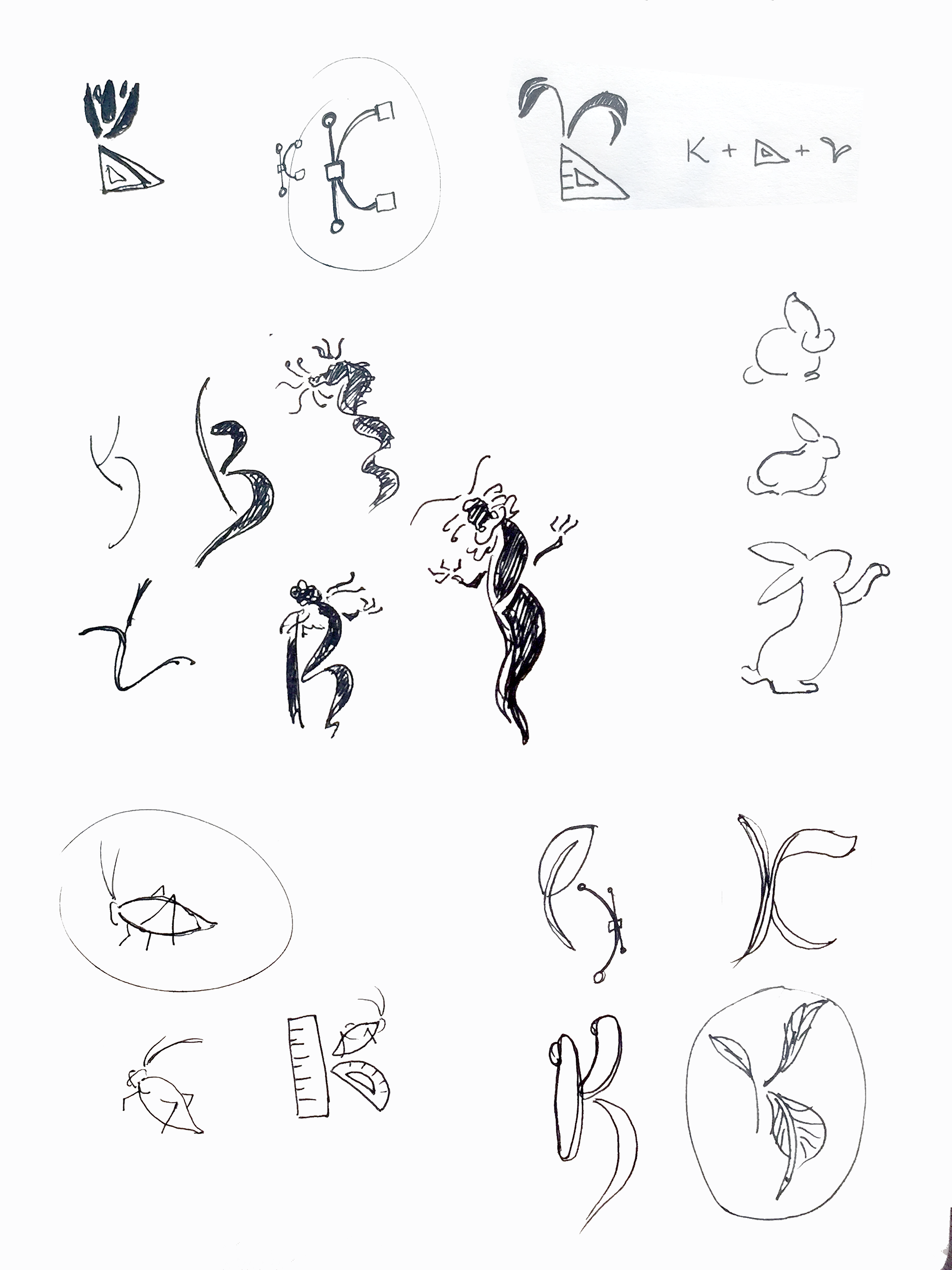
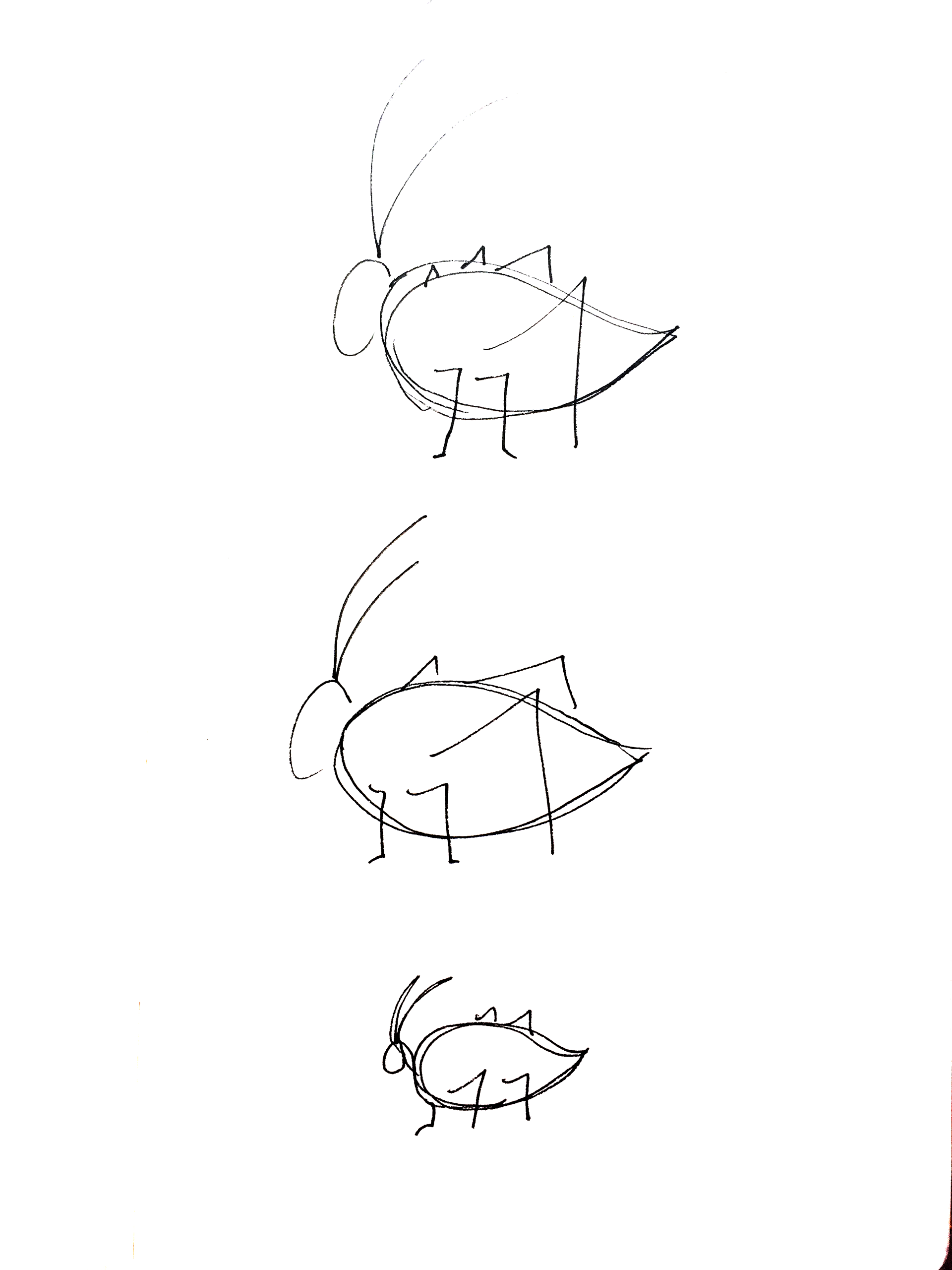
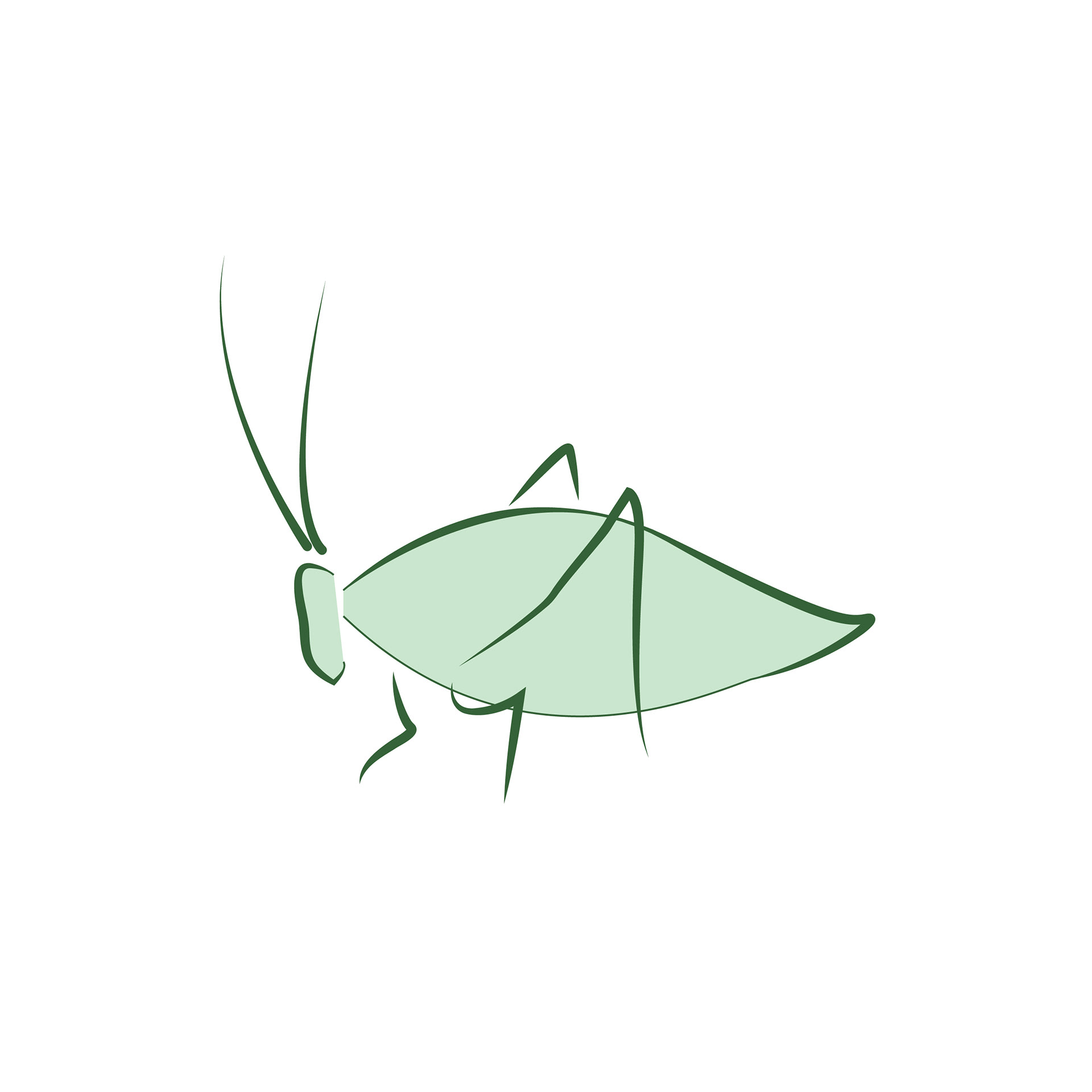
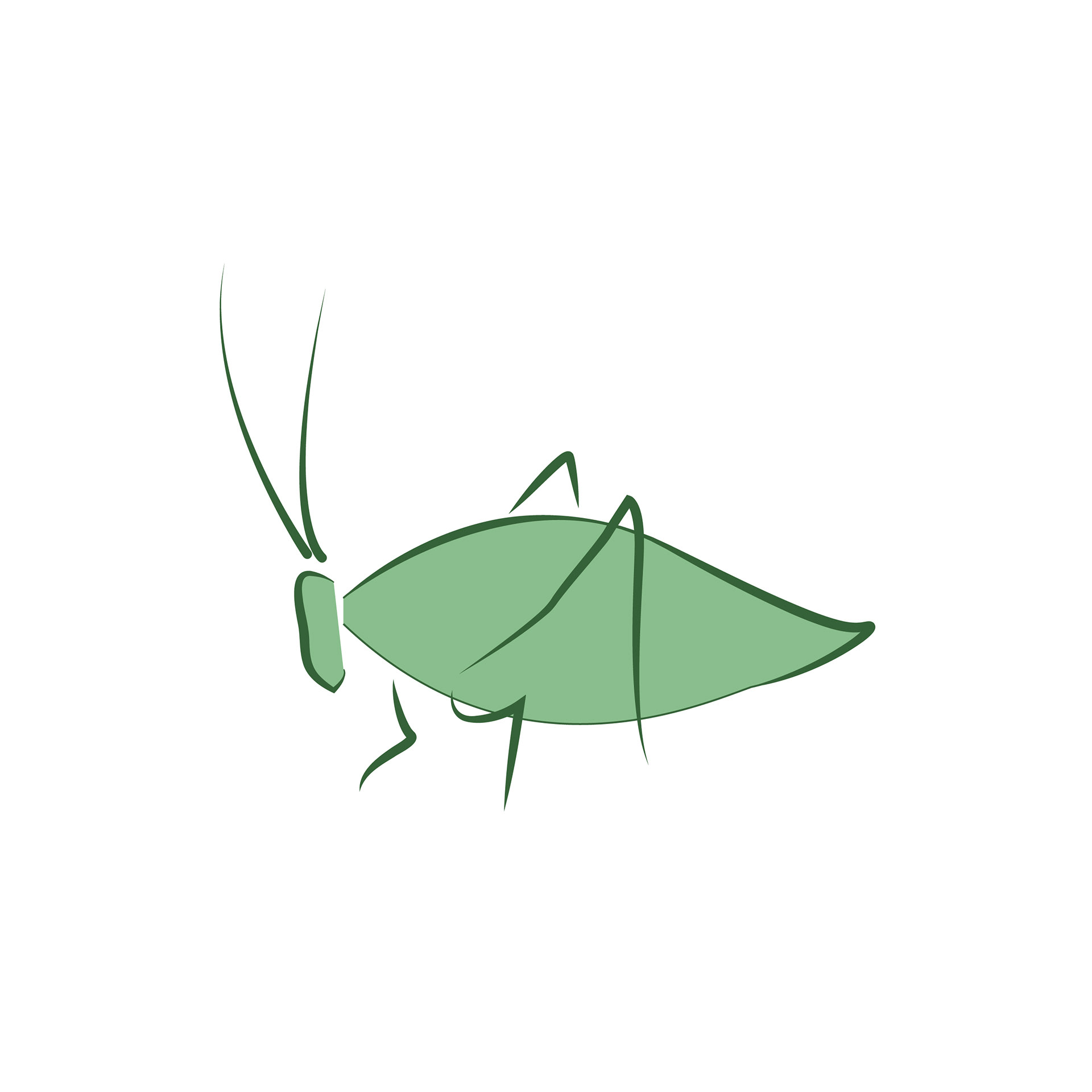
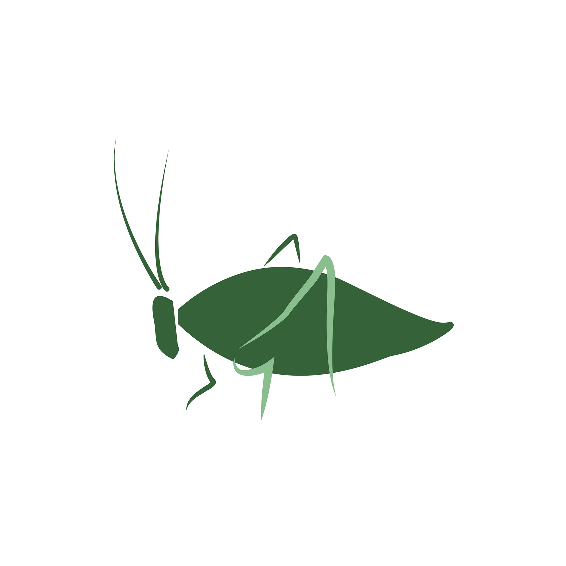
Animal representations: my Chinese name "Strong Dragon", rabbit for my Chinese birthyear, Katydid for the insect that I'm named after
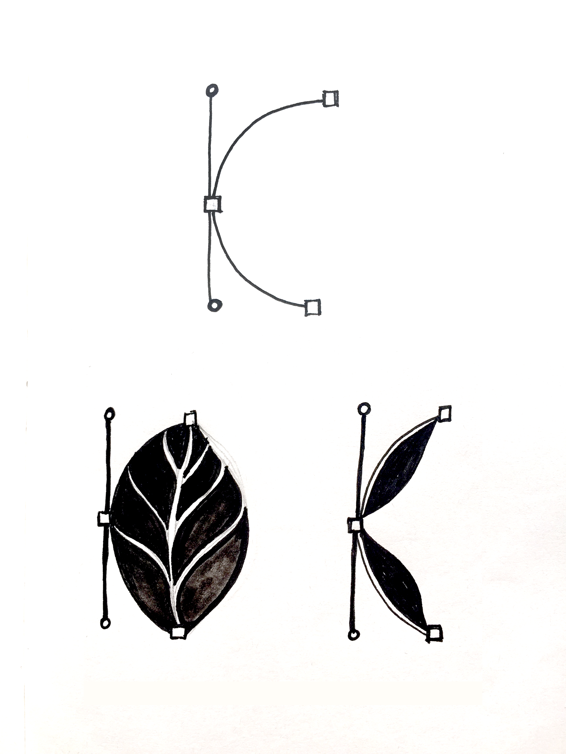
Refined Sketches
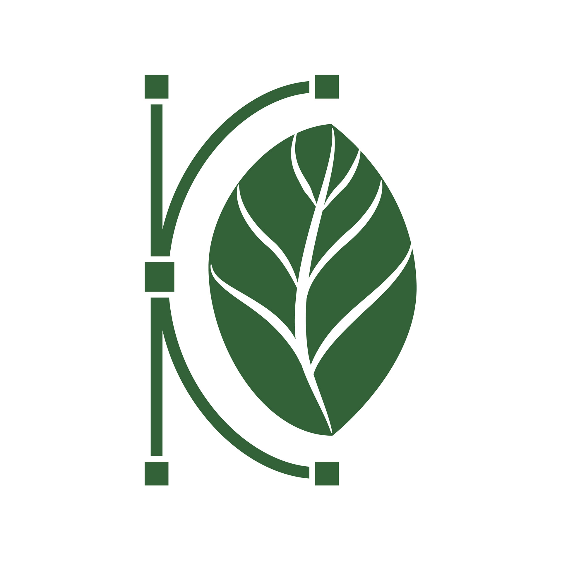
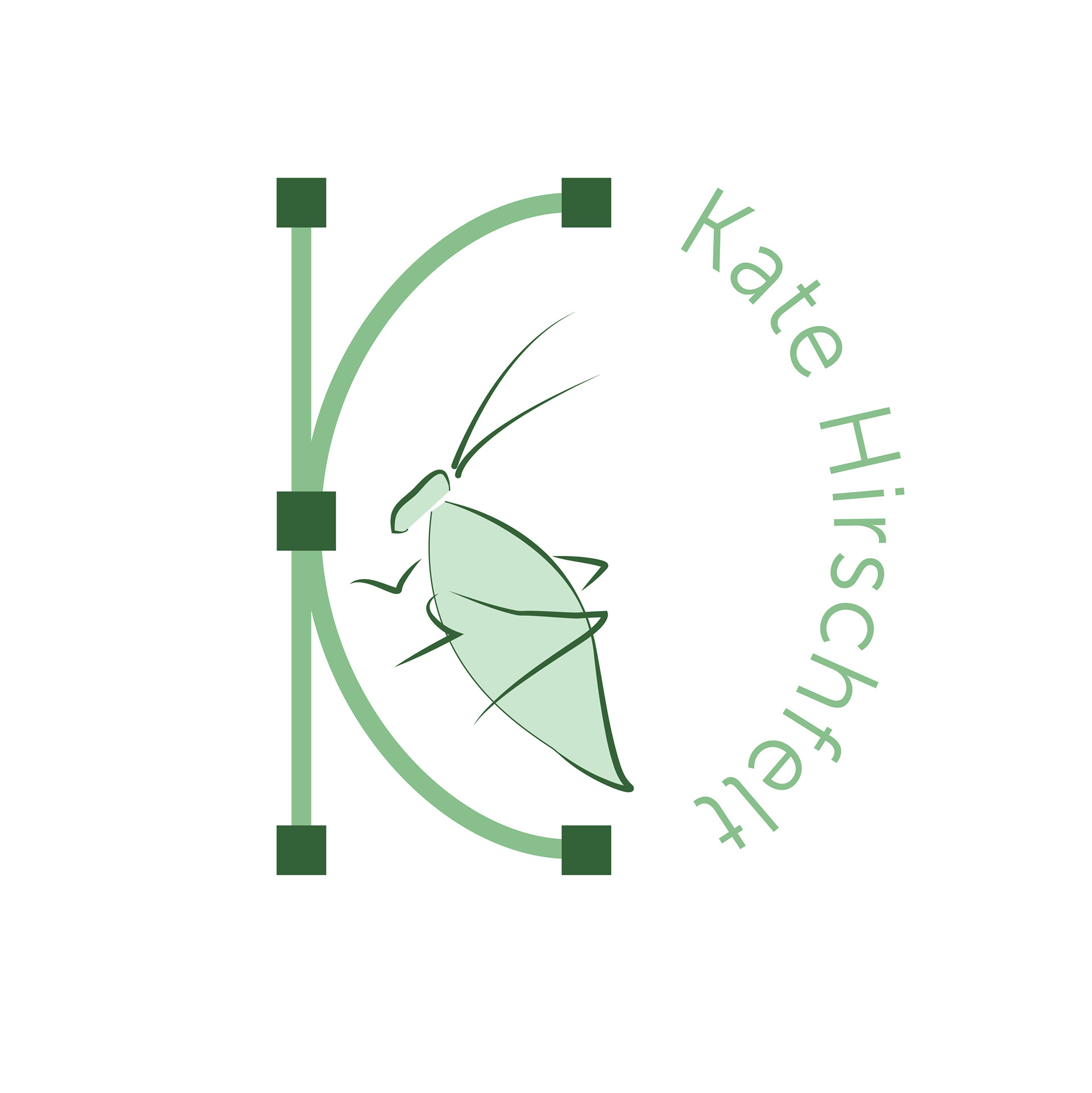
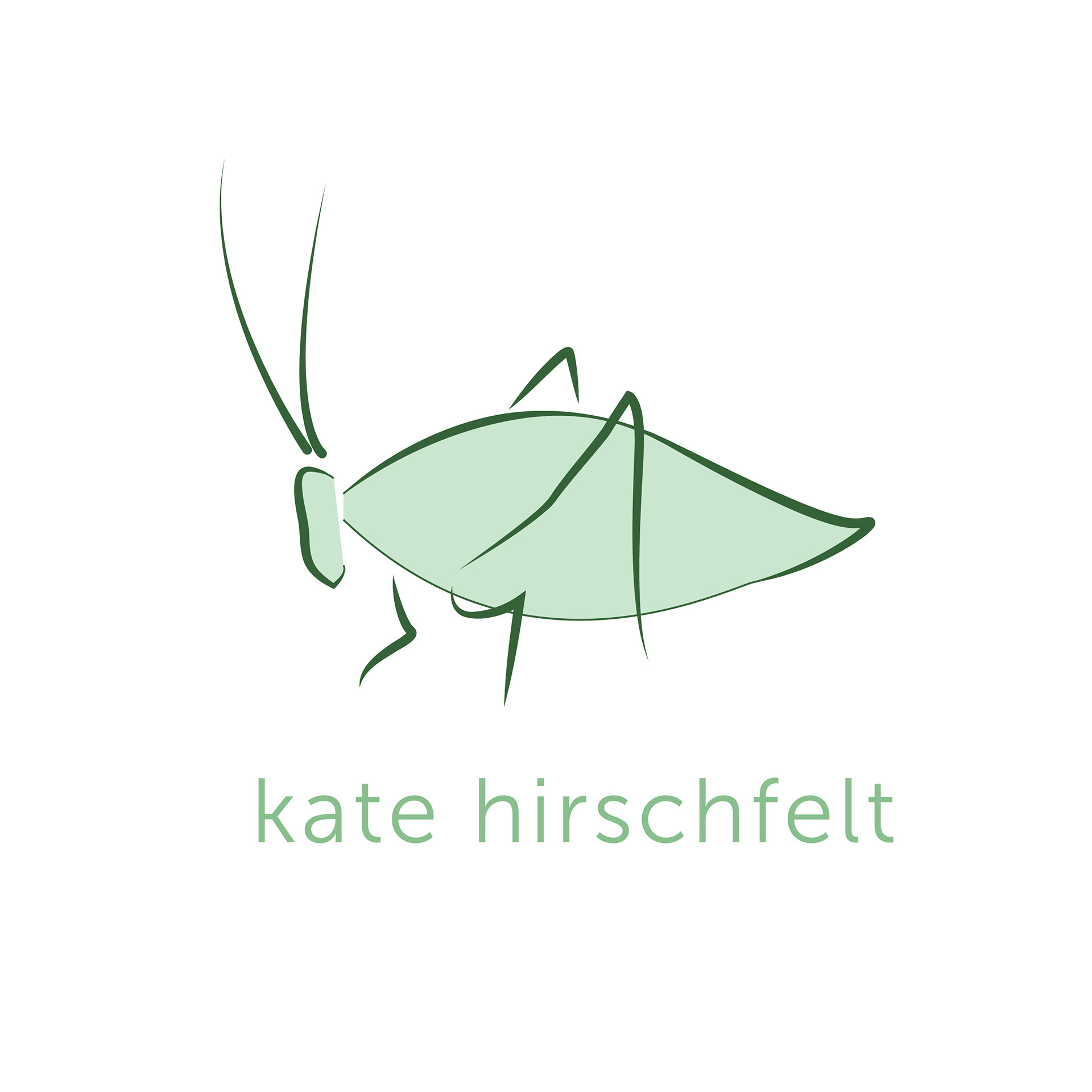
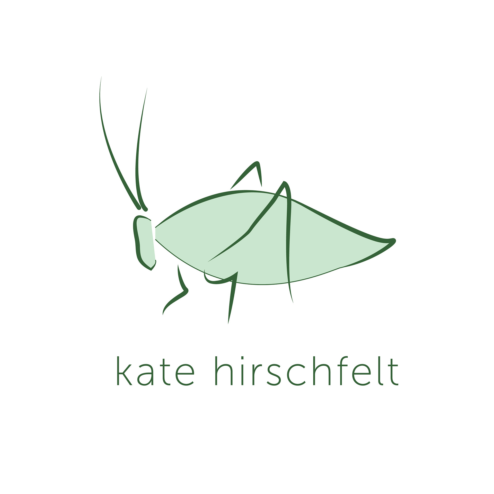
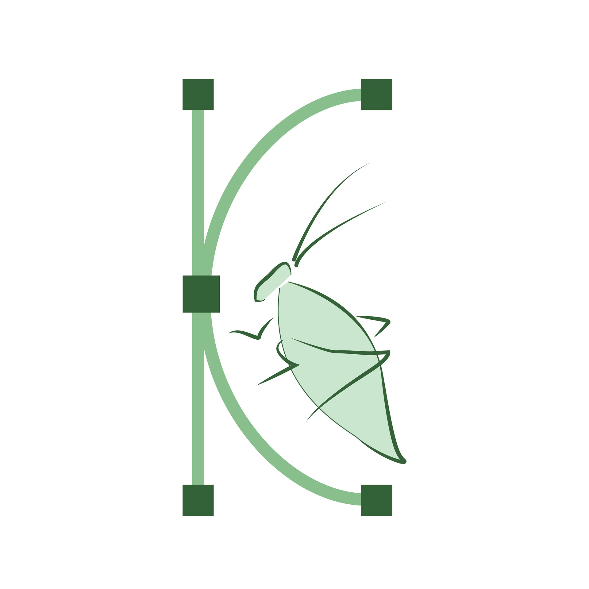
Larger and more detailed versions of the thumbnail sketches. The leafhopper is a visual representation of what I was named after, the middle one represents my passion for environmental sustainability, and the final set represents my design capabilities (pen tool, anchor points, bezier curves) and ecological values.
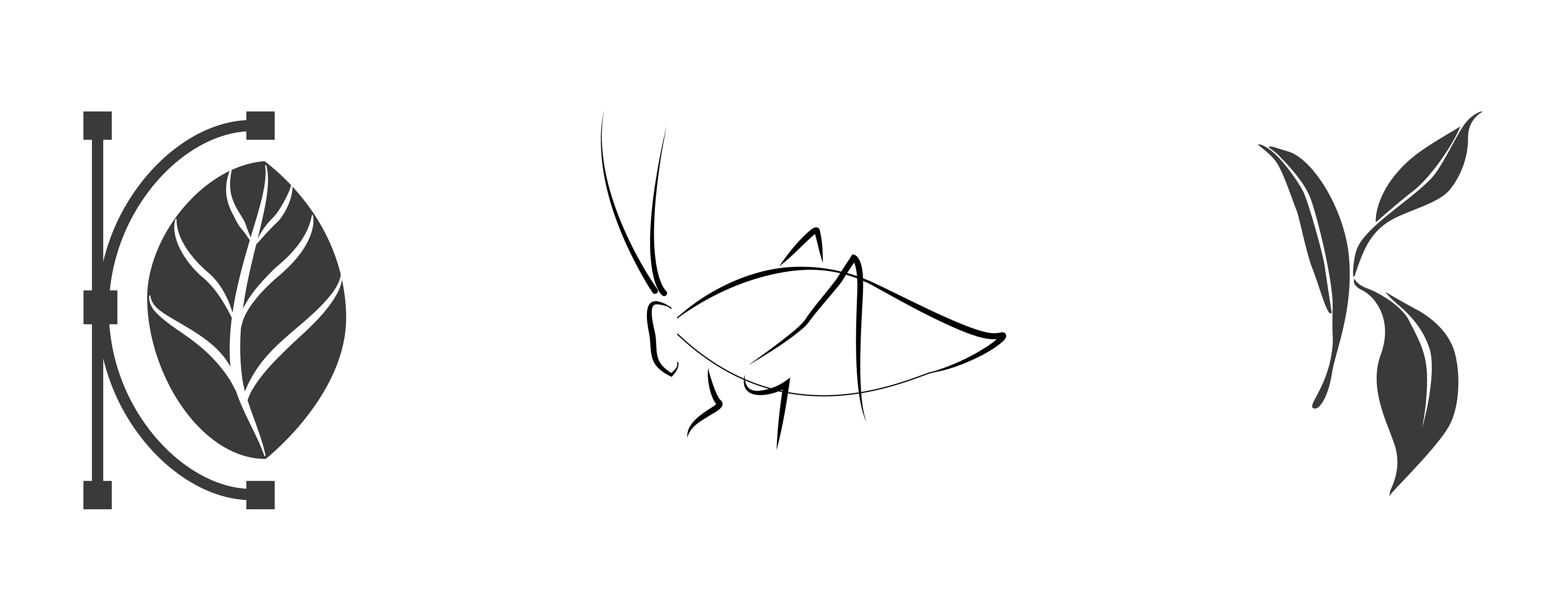
Digital: Phase 1
By omitting color and only focusing on line work, shape, and positive/negative shapes, I was able to analyze each design as a whole rather than a system of parts.
Digital: Phase 2
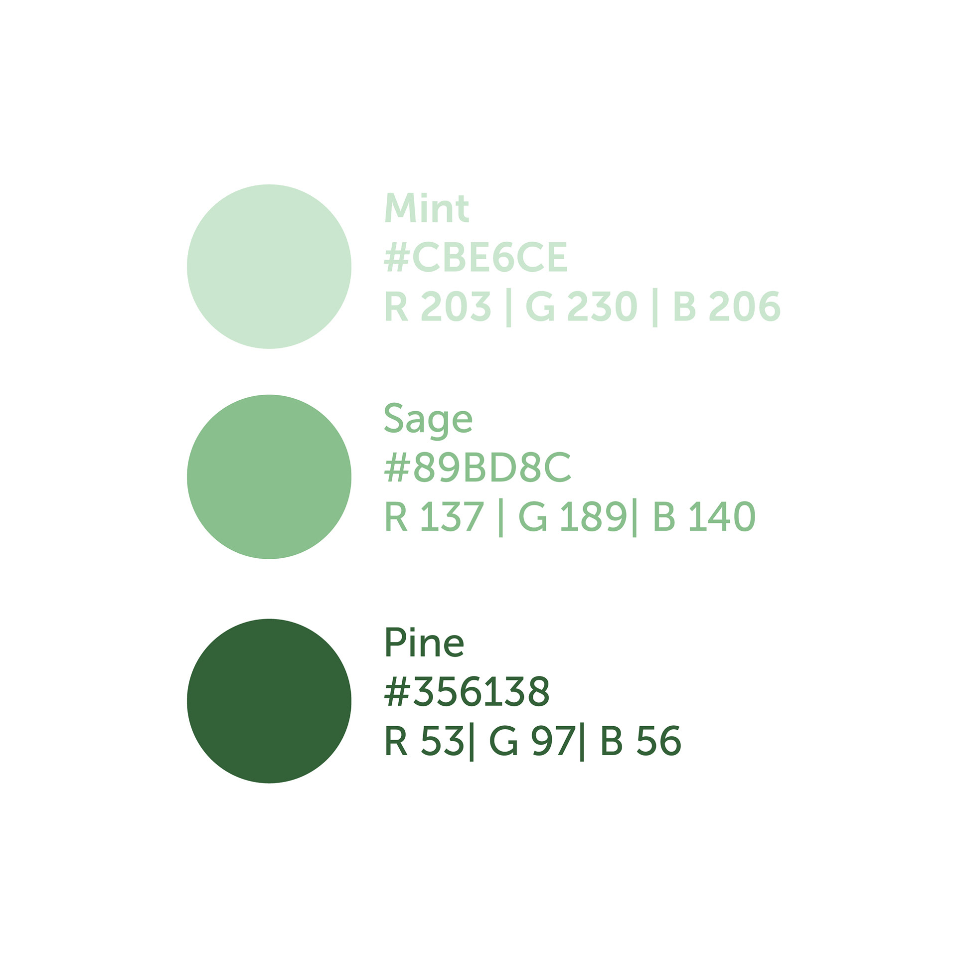
Color Exploration
I wanted to test the green color palette on each of the three designs to see how the hue and value affects them.
I started thinking of color as an extension of my personal branding assets and how it could unify the final logo with future business cards, stickers, letters, etc. I also started thinking of how I wanted color contrast to play a role in the visual logo vs. colored letterforms.


Digital: Phase 3
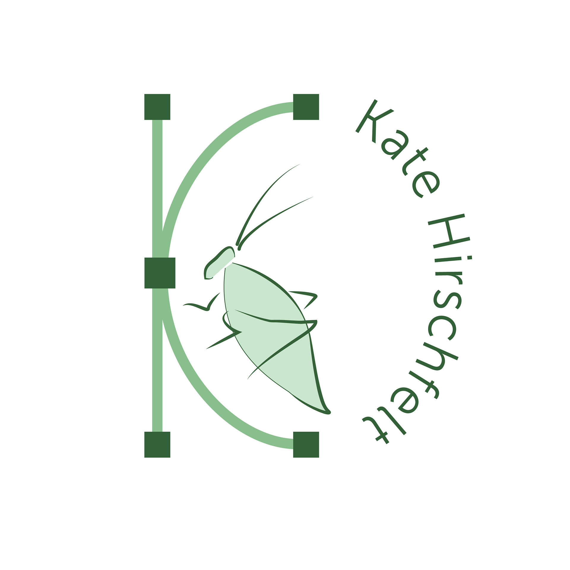
Phase 3 incorporates all elements needed for a secondary logo: 1. text (Museo Sans), 2. color, 3. icon. After some feedback from friends and family, I chose to substitute the leaf for a leafhopper in the design-focused logo because viewers weren't able to easily tell that it was a leaf.


Testing & Prototyping
This step tests how legible each logo is in different use-case scenerios. Since my logo will be viewed primarily on digital media, I chose to test them on desktop screens, mobile screens, and fauvicon icons (for scalability).


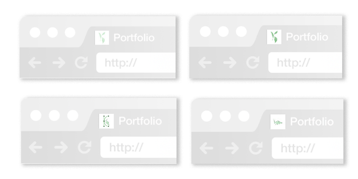
The leaf design (upper left) is too light to be legible at a small scale, which is why I tested it in the mid-tone hue (top right).
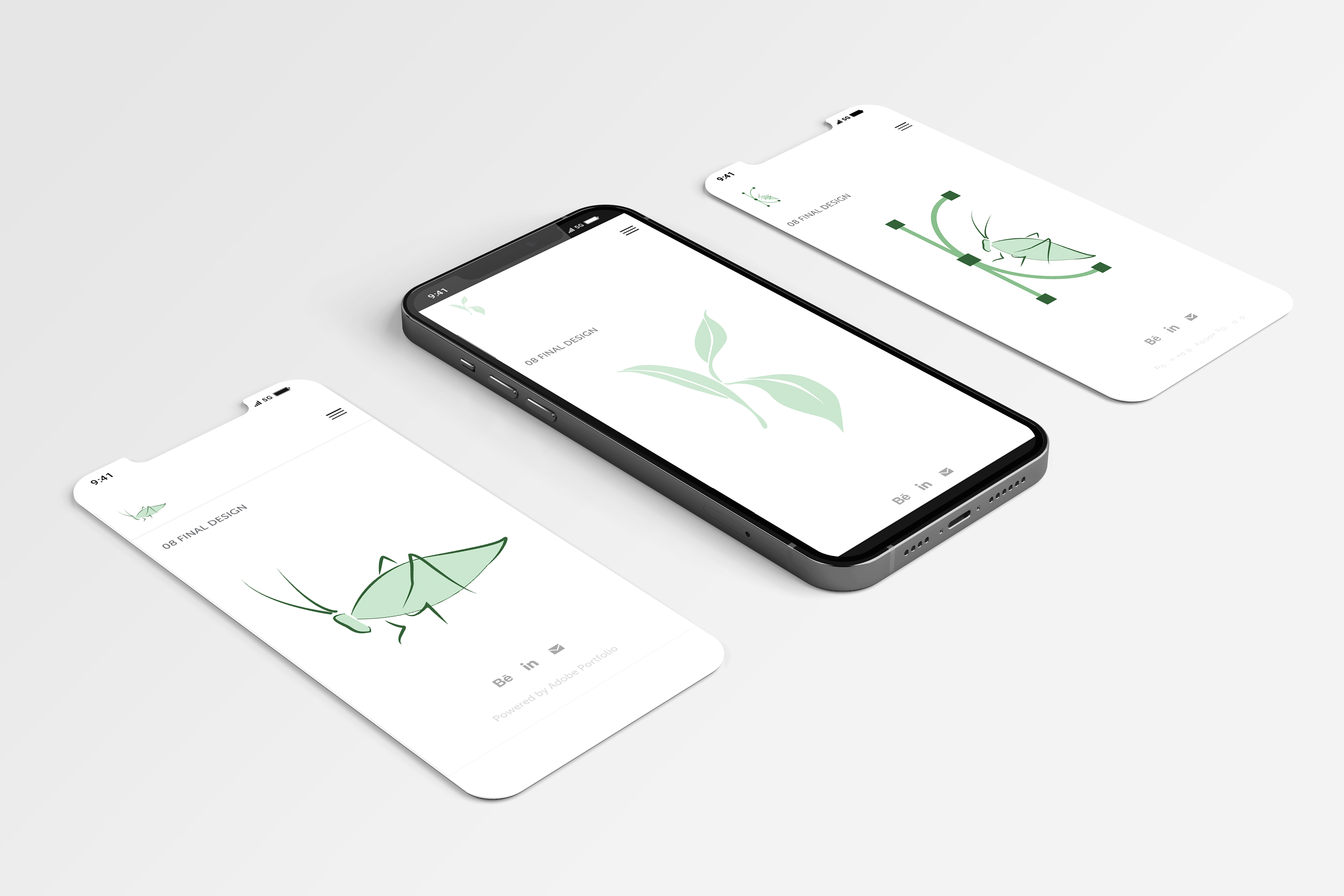
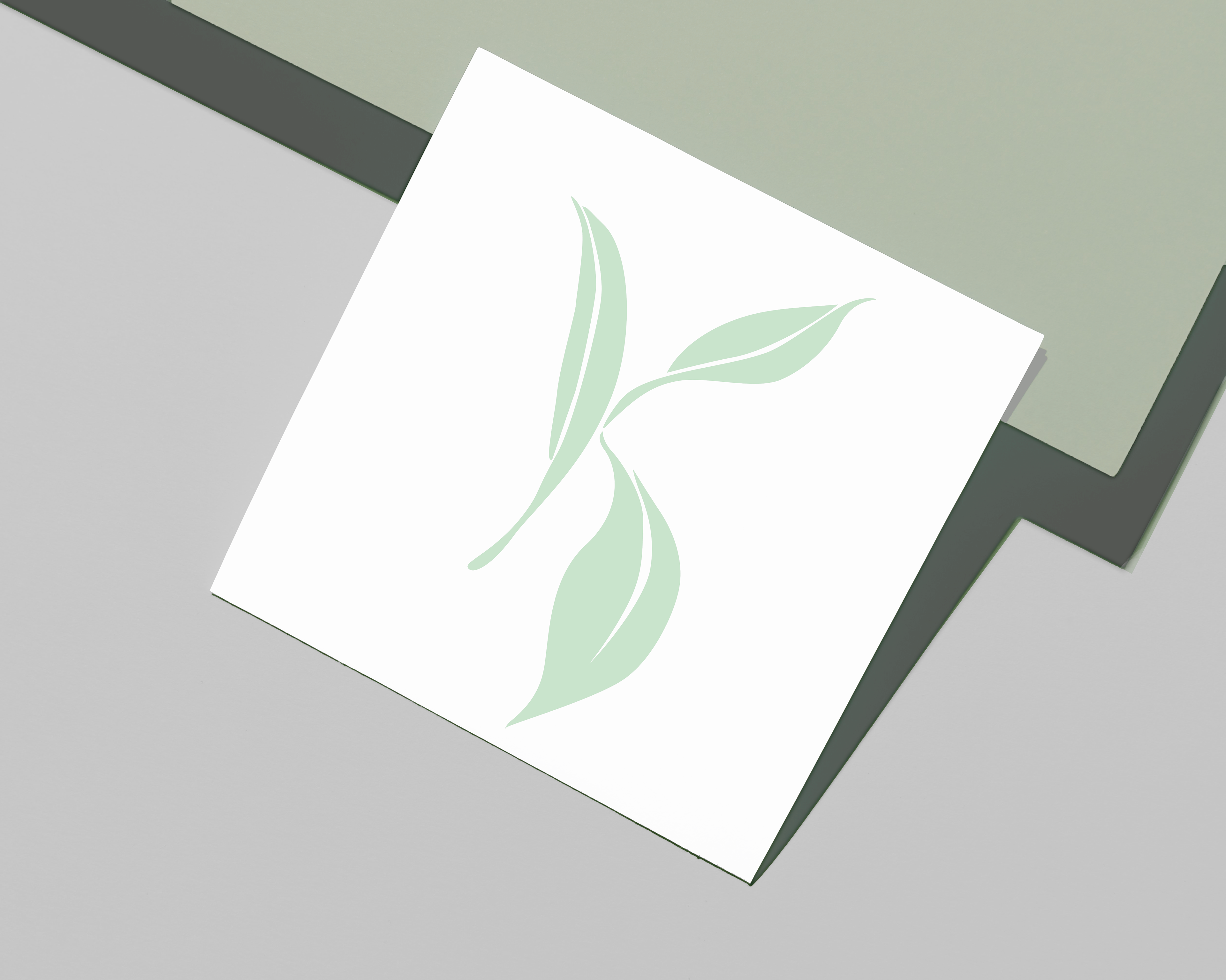
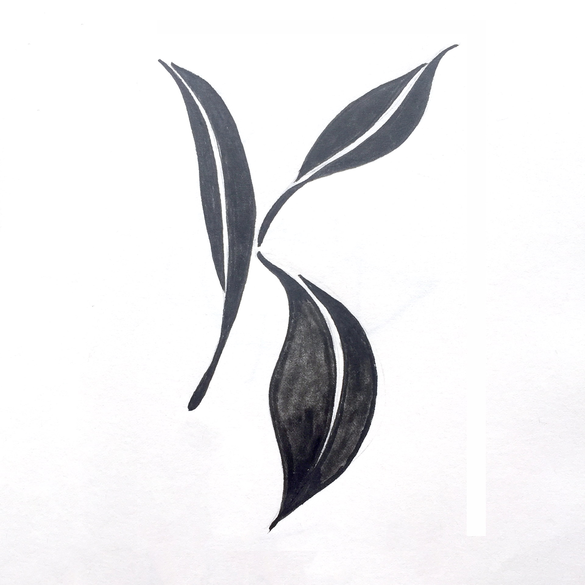
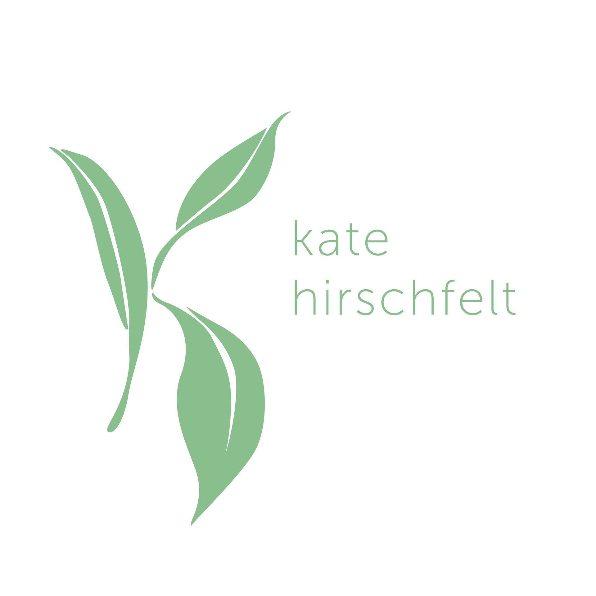
Final Design
Though it was a tough decision, I chose the leaf logo as my personal logo. It is minimal, yet detailed enough to symbolize different elements of myself. The 'K' shape represents my name, the leaves represent my sustainable values, and the delicate forms convey a designer/maker style which blends my studio arts background with graphic design. I especially like how the light green hue makes it feel approachable and calming.