
sandwish
delivering fast, easy, & customized orders
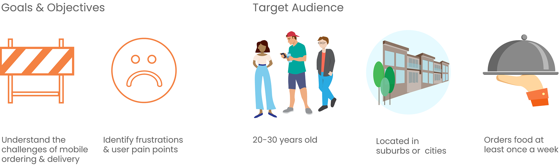
Project Overview
Existing food delivery apps don’t provide accurate delivery details, communication features, or order customizations. Sandwish is a food delivery app that allows users to have greater control and oversight of their orders and deliveries.
Role
UI/UX designer, UX researcher
Duration
June - July 2022
Project Type
Mobile IOS app
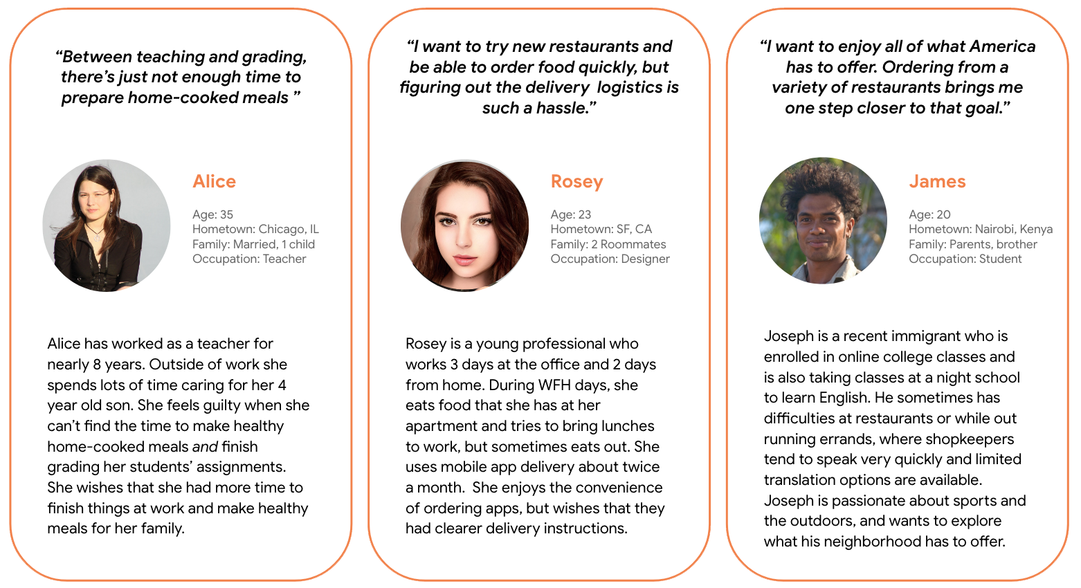
Interviews & User Personas
I interviewed participants over zoom to get a better understanding of the challenges and struggles that they face when ordering from a food delivery service. Convenience was a common motivation for busy adults to use food delivery apps. Delivery app users that I interviewed claimed to use delivery apps when they were too tired or too busy after working full-time jobs and supporting families.
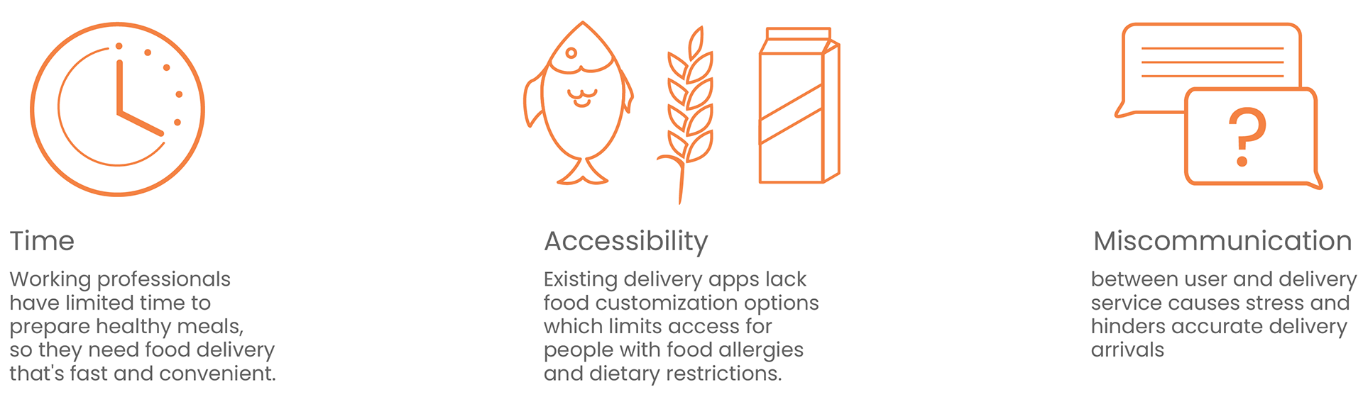
User Pain Points
Define
Problem statements, hypothesis, and HMW exercises helped me select which user pain point I should solve for.
I chose to focus on miscommunication since it was the most commonly recurring problem that users faced. Improved delivery instructions and communication methods would make the user experience more enjoyable and provide a unique value proposition that competitors lack.
"Sometimes the actual delivery is confusing. They might text instead of call and I'll miss it [the delivery]. Recently the delivery person left the food without notifying me ... I need a notification for that." - Participant A
Ideate
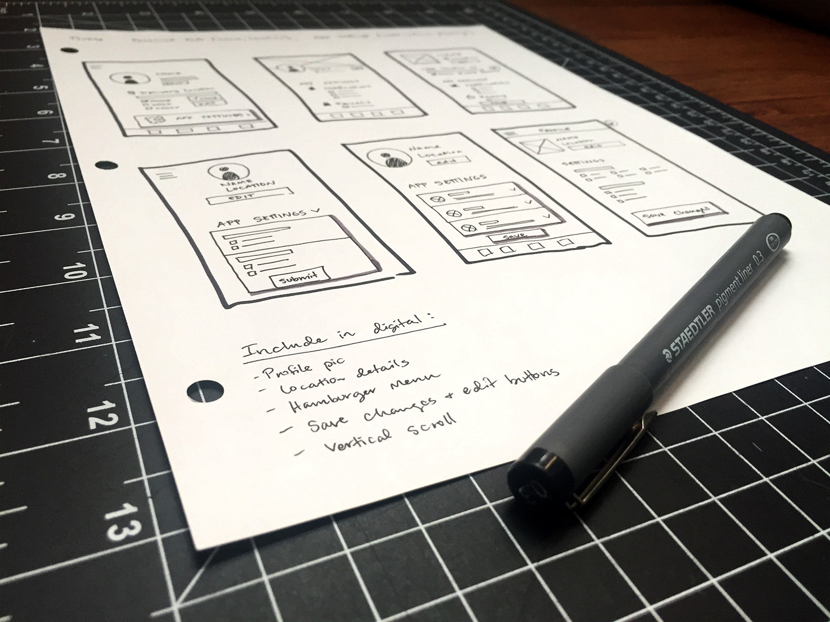
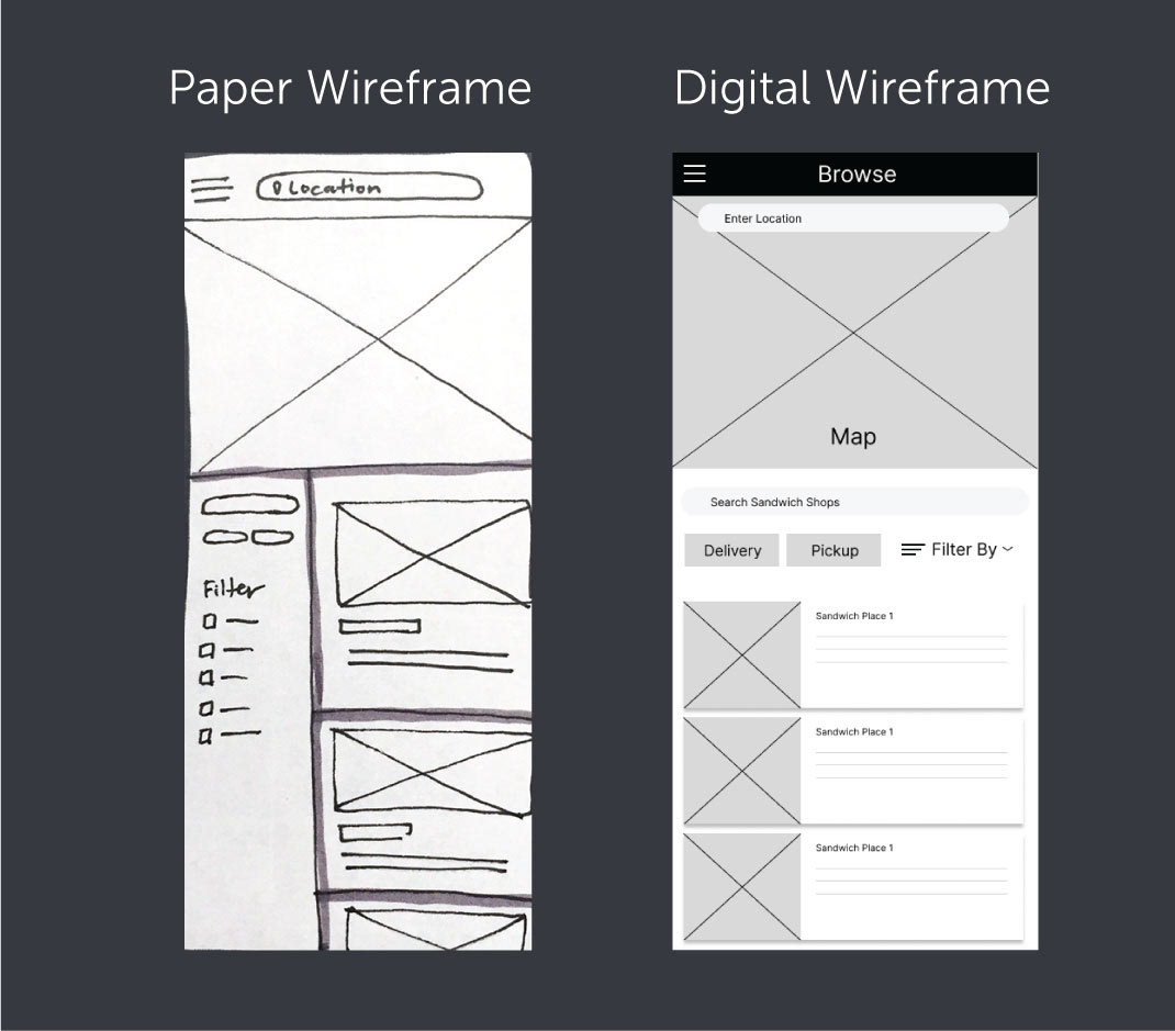
Wireframes
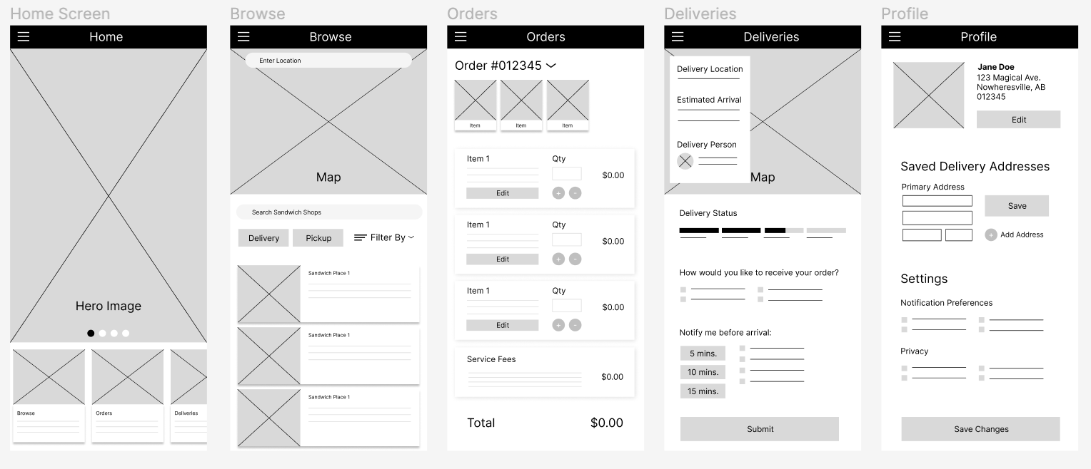
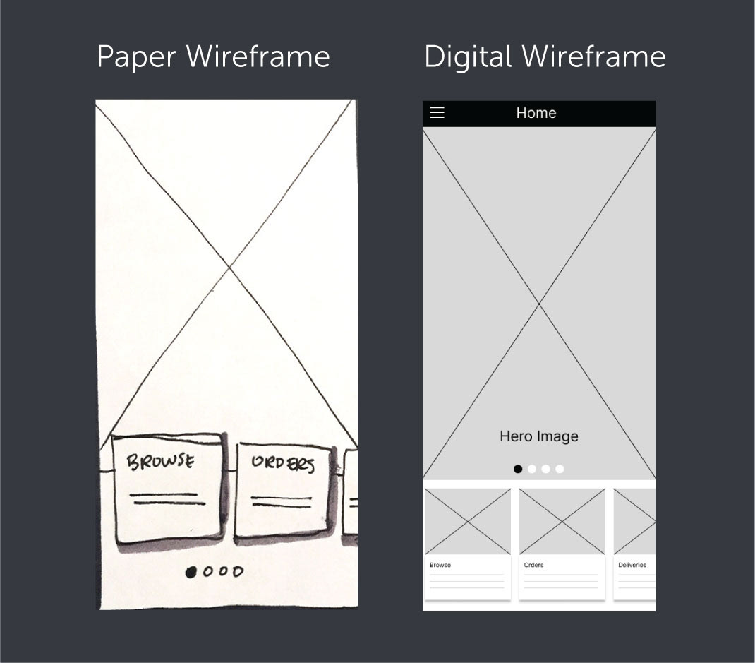
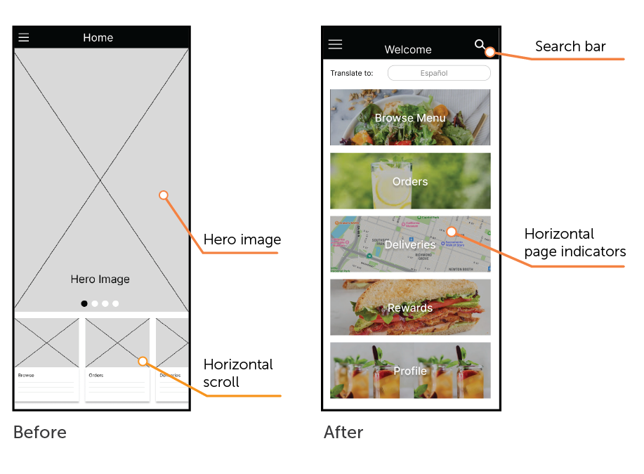
Home Page
I designed the home screen to be image-based with hero and carousel images, but user testing proved that it was confusing and not very user friendly. In later versions, I changed the structure to be more intuitive.
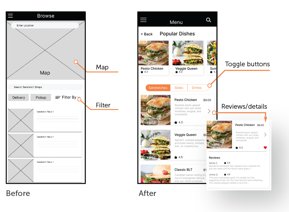
Browse Page
I thought a map feature would be a helpful search tool. However, user testing revealed that the map didn't enhance usability. One user even admitted that she prefers scrollable lists of options over a map.
I changed the app to focus on one sandwich shop and I show this page as a scrollable menu list. This change (applied in later versions) made a huge difference in later testing because users could easily see, read, and access information in bite-sized chunks.
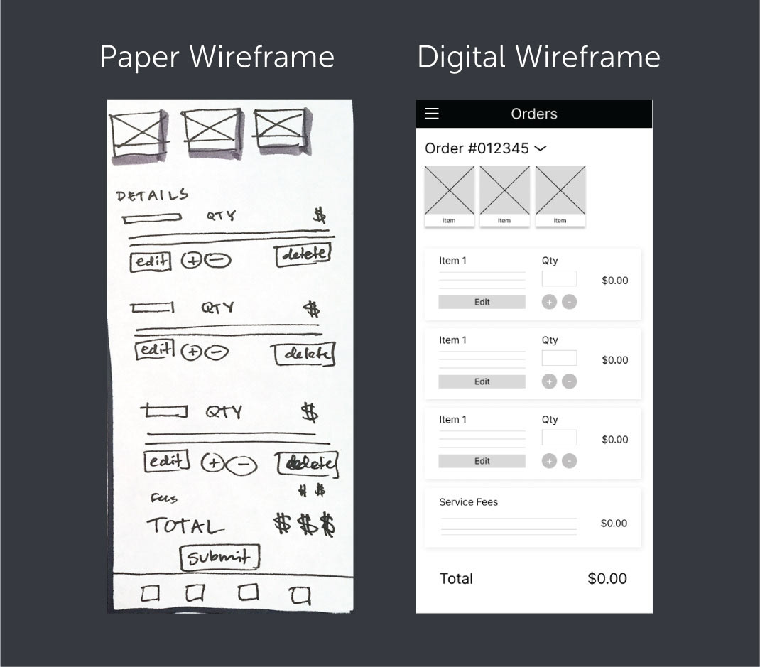
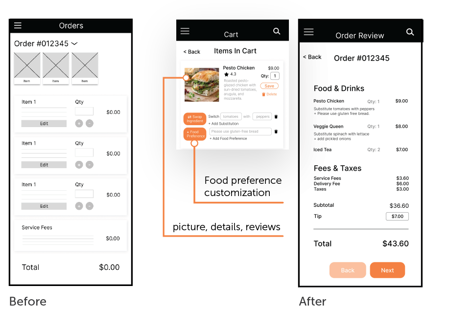
Orders Page
I combined items in a cart with the order summary to simplify the user flow. This makes the user journey smoother by consolidating ordering information with payment and food preferences.
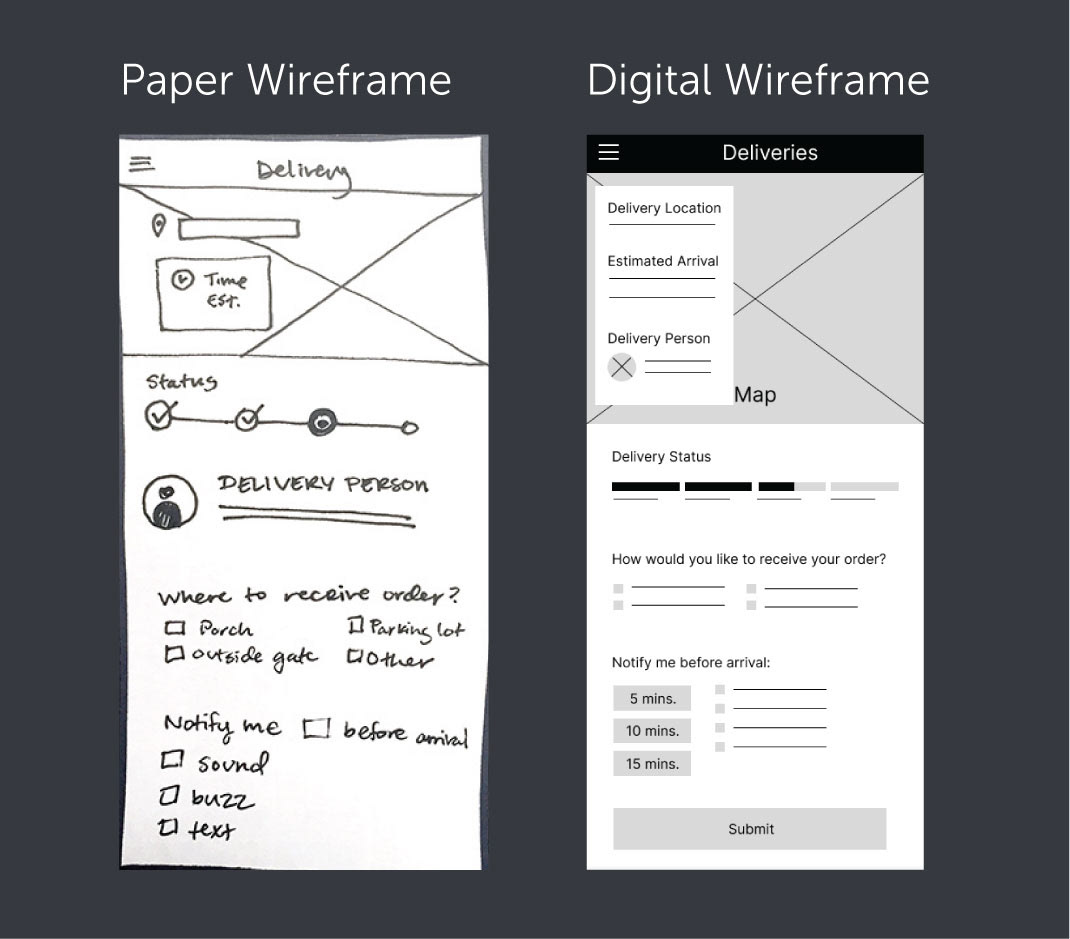
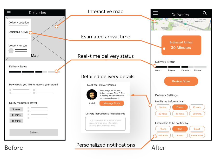
Delivery Page
I wanted to include features that connects users with their delivery person. I prioritized delivery instruction, arrival time, and notification preferences so that users could have more insight into their food delivery status.
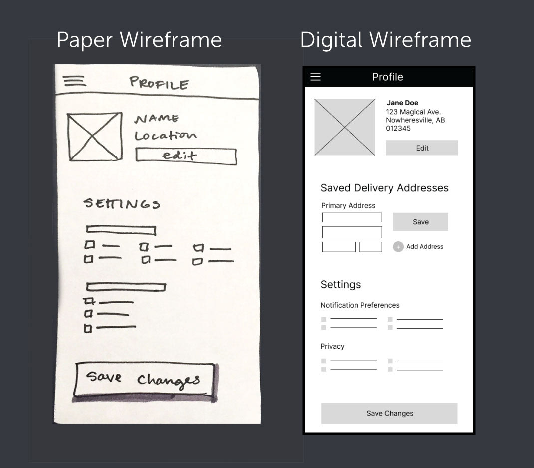
Profile Page
I wanted to simplify the profile and only include relevant user data. This was utilitarian and bland but after user feedback, succeeding versions became more engaging and interesting as I added things like rewards points and favorite dishes.
Research
I planned and conducted 7 moderated usability tests throughout the design process. The group was randomly divided and three of the seven participants tested the early stage wireframes while the remainder tested the clickable prototype. Participants in all testing sessions were asked to complete 3 tasks: add a sandwich to the cart, complete an order, and view the delivery status.
KPI's (Key Performance Indicators):
User error rate, User conversion rate, SUS (post-session survey)
Constraints:
Limited amount of interview participants, potentially non-diverse group (20-30 years old, local to California), increased chance of implicit bias and confirmation bias from solo UX Designer vs team/group.
User Testing
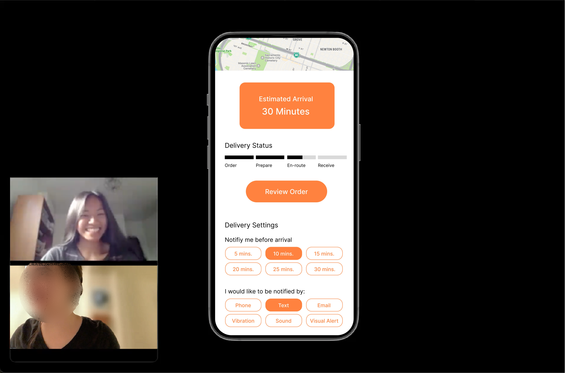
"This time estimation is good. A lot of times I don't know where it [my order] is or how long it's going to take, so I like that.
I also like these settings [delivery notifications] that I've never really seen before. I really appreciate it when you notify me when you're here, so I'm not doing something when my order arrives."
- Participant C
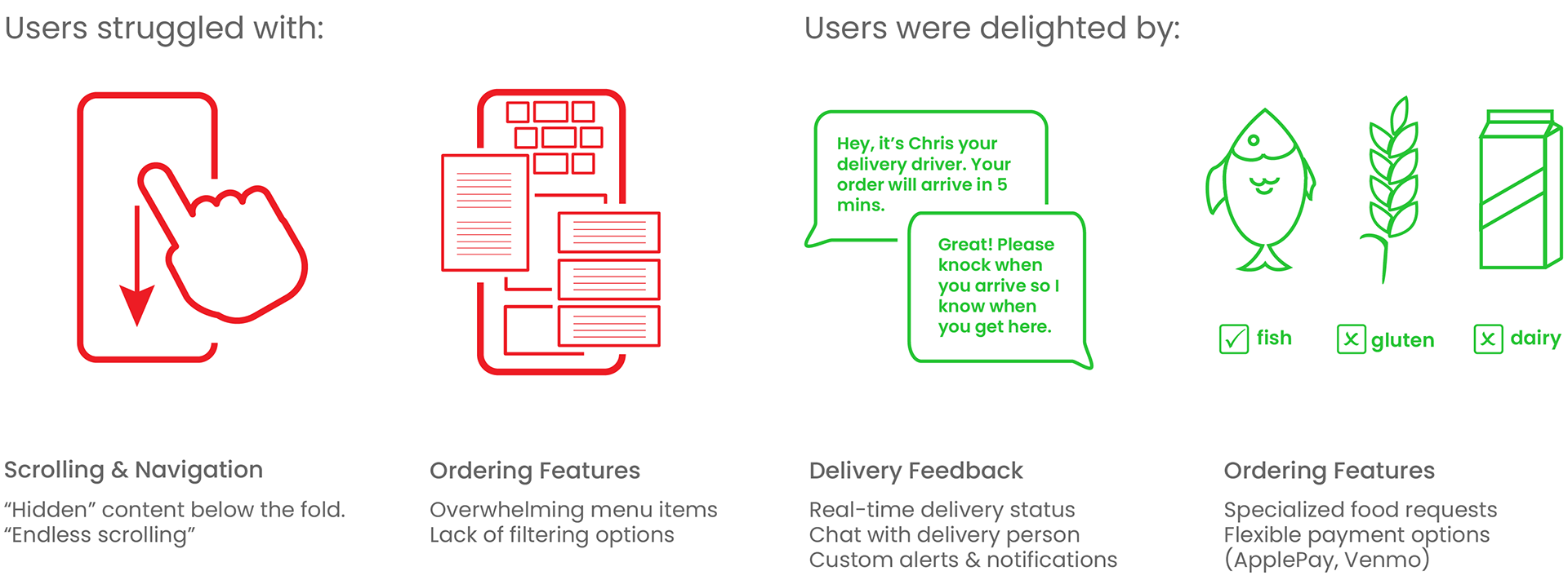
Findings & Observations
Prototype

Home Page
I wanted the home page to have a hero image to engage the user, but instead it confused users and created an unnecessary challenge before they even started an order! It wasn't obvious what users needed to do and some didn't even realize (until prompted) that the bottom contained page links.
I revised the design so that each section was fully visible. This way, all page options are in full-view, without the need for any scrolling. During the next round of user testing, participants could easily navigate to the ordering page.
Menu Page (originally Browse Page)
Originally this page was designed to search for local eateries, but this changed when I reduced the scope to focus on one gourmet shop. I replaced the map with a carousel of popular dishes to entice users. I separated the menu into sub-categories, making the menu more organized. Lastly, I created a separate page for users to see reviews, images, and ingredients.
Order Page
Initially I combined the items in cart with the order review page to streamline the ordering process, but it made the process more complicated because there were too many details on a single page.
I ended up splitting the order page into 2 phases: Items in Cart, and Order Review. Once the user selects their food, the Order Review gives them a chance to confirm quantity and price.
Delivery Page
This page provides the real-time delivery status, estimated arrival time, and an interactive map showing the delivery person en-route. The user has complete control of when and how the app notifies them. Notification options are inclusive of visual, auditory, and tactile alerts to better accommodate users who have disabilities.
Impact
According to the post-testing survey, 6/7 participants were impressed by the app's delivery features and 5/7 stated that they would recommend it to a friend.
Sandwish accomplished its goal of improving the user delivery experience by offering personalized delivery with excellent feedback and communication features.
Next Steps
Identifying Successes & Failures
Sandwich stands out from its competitors because it maintains clear communication with users throughout the delivery process and accommodates custom food and delivery preferences.
The app could do a better job at accommodating group and family orders. Currently, it's optimized for single orders, but future versions could include split bills, organization folders, and renaming tools for larger parties.
Opportunities for Improvement
If this were a real project, I conduct user testing with people with disabilities to see how I could better accommodate users with assistive technology. Based on user feedback, I might come up with different visual settings (dark mode, light mode, high contrast) to accommodate people with visual impairments. I might also include audio feedback and translation features for users who rely on audio prompts and descriptions.